How we use Sass Maps for Design Tokens and Developer Happiness

When building a design system there is always a set of global, shared properties that become the basis of everything that gets built. This is part of the atom level of the "Atomic Design" principle – the font sizes, weights, line heights, colours, borders, background, spacing, sizing and z-indexes that are the very core of every single piece of Interface in your UI library.
If you are particularly intent on building a system that promotes visual consistency across the entire application, and you really should be, then spending time defining this set of properties is invaluable. The Salesforce Lightning Design System call these "Design Tokens", and are a perfect candidate to become shared in your codebase for re-use; as they have done in defining Sass variables for them.
Naming things is Hard
Here at BC I've already mentioned our affection for Sass maps and map functions and that is especially relevant when we start considering sharing design tokens across our apps. I don't know about you, but no matter how good or clever your variable naming conventions are, naming stuff is hard and I find them invariably impossible to remember. You might use a full blown IDE that supports autocompletion, but I don't and we're really fond of building tools that help people without forcing too many opinions onto peoples workflows. Use whatever tools make you productive and we'll try and solve problems with some common sense and predictability.
That's why we think following the advice Erskine Design had for Friendlier Colour name with Sass maps can also be applied to things outside of just colours. It just makes sense.
Creating a Map Function
To quickly cover the approach again, we can create a function is Sass that takes an argument, which matches the key in a specific Map, and return the value of the key: fontSize("large") for example. To create something like this you firstly define the map:
$fontSizeMap: (
    large: 20px,
    small: 14px,
);
Then you would create a function which takes a single argument of "key", that is matched to the corresponding map:
@function fontSize($key) {
    @if map-has-key($fontSizeMap, $key) {
        @return map-get($fontSizeMap, $key);
    }
}
Now fontSize("large") returns 20px and fontSize("small") returns 14px. This can be extended really easily to take a second argument, which is super useful if your design token, like a colour, is split further down into tones. Again start by creating a map:
$colorMap: (
    primary: (
        base:  #00abc9,
        dark:  #009cb7,
        light: #c7e8ee
    ),
);
With this added depth in the map, we can make a minor adjustment to the example function above, so it can take a second argument to return the tone of the color we specify:
@function color($color, $tone: "base") {
    @if map-has-key($colorMap, $color) {
        @return map-get(map-get($colorMap, $color), $tone);
    }
}
Now color("primary") would return #00abc9 due to the default value of $tone being set to base, so no need to pass it in. color("primary", "dark") would return #009cb7. Super useful!
This is starting to feel a bit more manageable, and if we couple this with a simple convention our developer experience should become a lot better for those who really don't get along with CSS very well.
Defining the API
We first started by defining what types of design tokens we needed and settled on a camelCase naming convention, which essentially maps to the name of the CSS property it relates to (where ever possible). So we ended up with a list of design tokens that looks like:
color()fontSize()fontWeight()lineHeight()letterSpacing()fontFamily()spacing()zIndex()container()screenSize()
We then set out how we would define the variation in each property, based on a predictable scale of comparative adjectives that best relate to the type of property. Large or Small, Dark or Light, High or Low.
| Color | Line Height, Letter Spacing | Font Size, | zIndex |
|---|---|---|---|
| Hero | |||
| Darkest | Largest | Largest | Highest |
| Darker | Larger | Larger | Higher |
| Dark | Large | Large | High |
| Base | Base | Base | |
| Light | Small | Small | Low |
| Lighter | Smaller | Smaller | Lower |
| Lightest | Smallest | Smallest | Lowest |
| Tiny |
Some examples might be: lineHeight("large"), zIndex("lowest"), color("grey", "darker"). As you can imagine people find this incredibly easy to deal with and remember, it's one of the favourite features our JavaScript engineers like about our CSS framework.
Not only is it easy to remember but it helps build consistency and predictability into our code. Basing values on a set scale makes dealing with something like z-index on a large application, so much easier. No more fighting magic random numbers!
Special Cases
Obviously from the list of design tokens, not all of them fit the scale so we have a couple of special cases that align more to their specific concerns or values. Font weight makes more sense to follow the real weight values you can set in CSS, for example. To make things easier to create sizes and spacing in our UI, we use a fraction based scale: single, half, quarter etc
| Font Family | Font Weight | Screen Sizes | Spacing |
|---|---|---|---|
| sans | black | xxlarge | Double |
| serif | bold | xlarge | Single |
| mono | semibold | large | Base |
| medium | medium | Half | |
| normal | small | Third | |
| thin | xsmall | Quarter | |
| xxsmall | Fifth | ||
| Sixth | |||
| Eighth |
The Spacing map is pretty special and we'll be covering that in a lot more detail in another post, but in brief; any declaration of padding, margin and positioning should only ever be one, or a combination of, any of the units listed above: padding: spacing("half");.
Containers
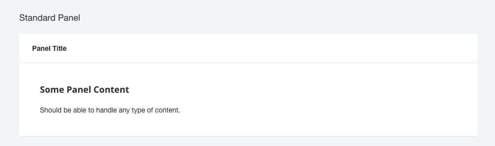
Our final map is "container". As with a lot of websites and applications, the practice of "containing" content or information is pretty standard practice. We use panels, wells, modals, tables, forms; all kinds of concepts in any one application to contains parts of our user interface and consistency in how they look is key.
So to make sure all our "containers" use the same background fills, border styles and drop shadows, we use a Sass map to help us.
$containersMap: (
    border: (
        base: $container-border-global-base,
        dark: $container-border-global-dark
    ),

    borderColor: (
        base: $container-border-global-color-base,
        dark: $container-border-global-color-dark
    ),

    borderSize: (
        base: $container-border-global-size
    ),

    borderStyle: (
        base: $container-border-global-style
    ),

    dropShadow: (
        base: $container-drop-shadow-base
    ),

    fill: (
        base: $container-fill-base,
        dark: $container-fill-dark
    ),

    margin: (
        base: $container-margin-base
    ),

    padding: (
        base: $container-padding-base,
        large: $container-padding-large
    )
);
A typical implementation of a contained component might look something like:
.containedComponent {
    background: container("fill");
    border: container("border");
    box-shadow: container("dropShadow");
    padding: container("padding");
    margin-bottom: container("margin");
}
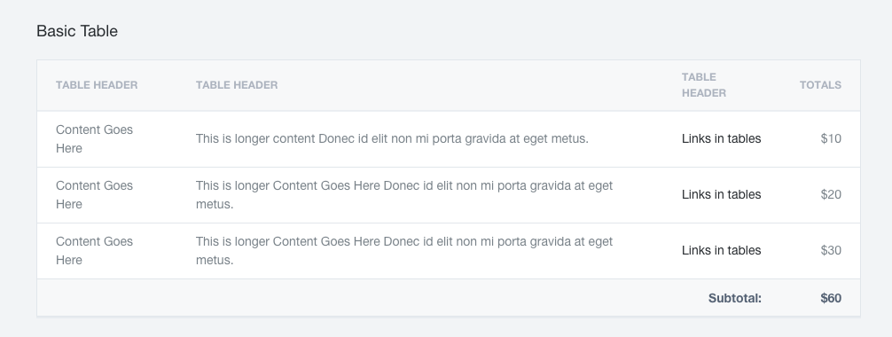
Obviously if every contained component were always that consistent, we could just abstract that into it's own re-useable container style, but in reality a lot of our containers might share similarities but have slightly different combinations and variations of those properties. Our panels for example only have an internal border, and the bottom drop shadow, but those styles are shared with our tables which also have borders all the way round (the same borders) and they both share a background colour.
If we wanted to change how we visually treat containment, the chances are we'd change both panels and tables equally. They do a similar job, they're just treated slightly differently based on their use case or data type. We've found this is a really great way to deal with these kind of design tokens without engineers re-inventing the wheel in every project, and potentially having interface components becoming visually out of sync across the application.
Summary
In summary, the way we've decided to use Sass maps and map functions to handle our design tokens has been incredibly successful. Our engineers love the simplicity it brings to their work flow, reducing the amount of decisions they need to make, and find them ridiculously easy to remember.
The consistency it brings to our code is extremely useful, especially when you have had to struggle with magic numbers an engineer may choose when solving a particular, but common problem. The predictability in knowing the range of pre-defined values a property could only ever be, is really handy in debugging z-index issues for example.
Often the constraint it places on the design of our components and patterns also really helps us think a lot more about the quality and shared visual consistency across the entire application. It reduces decision fatigue and creates a really solid feel to our component library.
Give it a go, maybe you'll find the same kind of successes we did in implementing a similar system in your codebase.
We're currently hiring for amazing Front-End Engineers that understand these principles to join our UI Platform team. If you're experienced in creating and shaping user interface guidelines and you like what you read, get in touch.