Plotting with Dots

Most system monitoring tools and load test tools output line graphs, where data values are averaged per second or per minute, and the resulting set of averages is then plotted joined with lines.
In doing this averaging and connecting with lines, important information is lost, along with lots of interesting drama and eye candy.
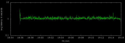
For example, here is a line graph of one-minute average ping times from the Bigcommerce office in San Francisco to www.google.com:
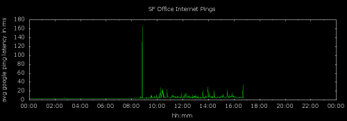
It’s moderately informative, showing latency rising during business hours, but if we plot each individual ping time separately as a dot, we see additional range and distribution information. Note that the highest average ping time in the graph above is about 160ms, but the highest absolute time in the dot graph is close to 300ms.
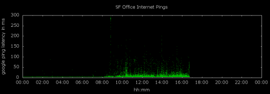
As you can see, plotting with dots gives you a higher density of information.
Plotting a larger data set
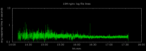
Let’s try plotting a much larger data set. Here is a plot of 10 million web server response times from nginx logs, averaged per second with the averages connected by lines:
Plotting the same 10 million points individually paints a more nuanced picture.
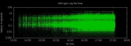
We can now see that the traffic in the first half of the time range was significantly lighter, and that this is probably why there is greater variation in average response time.
The horizontal streaks at the bottom are due to the limit of our web server’s response timing resolution of 1ms.
Lines obscure data
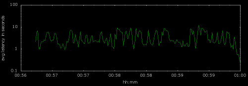
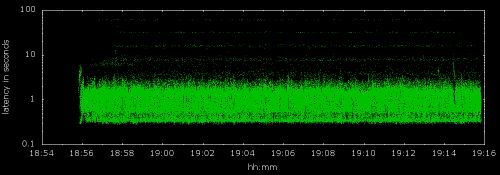
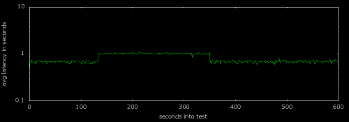
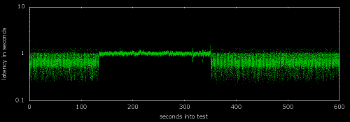
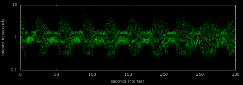
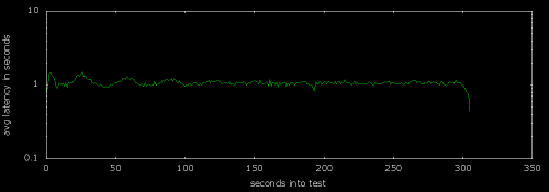
Connecting the dots also obscures gaps in your data. Here is the average latency of responses during a load test:
And here is the same data with every result latency plotted individually:
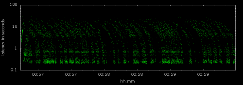
It turns out that responses came back in clumps with gaps of silence between the clumps, but we did not see that attribute in the top graph.
The curves in the bottom graph seem odd at first, but can be understood as an artifact of plotting time against time. The x-axis is the time the request started, and the y-axis is the amount of time the request took to complete. Since we are plotting on a log scale, the curves in the bottom graph are the result you get when a set of requests which started at different times all return at the same time.
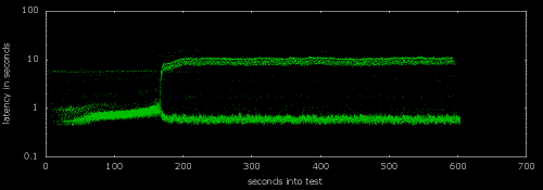
Identifying a slow server
Here’s the result of a load test which was making requests to three different servers:
From the usual line graph, you would not know that one of the three servers was far slower than the others, but it really stands out when you plot the response time points individually:
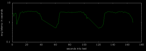
Here’s a load test result of smoothly ramping up the load on a web page backed by 3 servers:
The latency suddenly “breaks” at about second 160 when one of the servers spins out of control, raising overall latency.
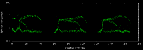
This is interesting, but not as interesting as actually seeing how the response times bifurcated at that point, which is what a dot graph of the same data shows. The one bad server tied up a lot of the load generation clients for 10 seconds at a time, resulting in lower load on the remaining two servers and good response times for them.
And when load test results start to get really weird, we can use dot graphs to distinguish a trifurcation in the response times and to see long stalls before responses resume and then crash again:
Network packet timeouts
Network packet timeouts and retransmits are a classic performance problem made visible by plotting with points. Here is a graph of a load test against a web server with a moderately bad network connection:
From the upper graph it is not at all obvious that any packets were lost and retransmitted, but as soon as we plot all the points in the same raw data, we see the characteristic horizontal bands caused by exponentially increasing TCP timeouts. The timeout bands are a fixed width apart on this log scale graph.
Plotting latency
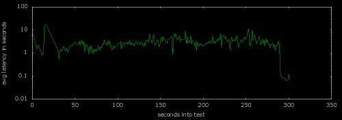
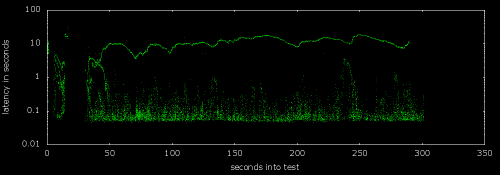
Below is another load test shows a bump in response time during an experiment.
What the line graph fails to show is the greatly restricted range of latencies during that experiment:
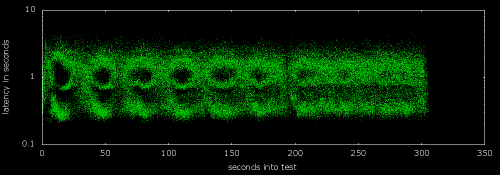
Pulsating response time
We also don’t get a good feel for the pulsating nature of the responses during this load test until we plot with dots:
Similarly, this line graph doesn’t really illustrate the smoothing of the waves in response times as the test goes on:
But the dot graph of the same data does:
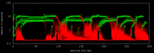
Plotting HTTP 200 OK and HTTP 502 Bad Gateway
Finally, we plot results of an extreme load test with 200 OK responses in green and 502 Bad Gateway responses in red:
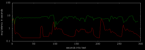
Informative, but the line graph hides the fact that the Bad Gateway latencies are actually continuous with OK latencies at many points:
In summary, line graphs are** simple to create and understand, but they hide lots of useful information** like data range, volume, distribution, outliers, striping, gaps, etc.
There are some downsides of creating dot graphs though. They require much more data storage (every data point, of course), and the standard tools such as graphite generally don’t support them. These graphs were created with Gnuplot.
In case you want to get started with Gnuplot on your own, here is what I used to create the second graph in this post.
The data file used to generate the graph:
% head data.txt
2015 04 06 00 00 01 3.81
2015 04 06 00 00 02 3.92
2015 04 06 00 00 03 3.90
2015 04 06 00 00 04 3.91
2015 04 06 00 00 05 3.90
2015 04 06 00 00 06 3.89
2015 04 06 00 00 07 3.90
2015 04 06 00 00 08 3.93
2015 04 06 00 00 10 3.93
2015 04 06 00 00 11 3.93
The GnuPlot configuration file:
% cat graph.gp
set output 'dots_pinger.png'
set term png size 1000,350 enhanced font '/usr/share/fonts/liberation/LiberationSans-Regular.ttf' 12
set title 'SF Office Internet Pings' textcolor rgb '#FFFFFF' font 'SVBasic Manual, 12'
set xlabel 'hh:mm' textcolor rgb '#FFFFFF' font 'SVBasic Manual, 12'
set ylabel 'google ping latency in ms' textcolor rgb '#FFFFFF' font 'SVBasic Manual, 12'
set yrange [0:]
set xdata time
set timefmt '%H %M %S'
set xrange ['00 00 00':'23 59 59']
set format x '%H:%M'
set object 1 rectangle from screen 0,0 to screen 1,1 fillcolor rgb'#000000' behind
set xtics textcolor rgb '#FFFFFF' font 'SVBasic Manual, 12'
set ytics textcolor rgb '#FFFFFF' font 'SVBasic Manual, 12'
set border lc rgb '#FFFFFF'
plot 'data.txt' using 4:7 notitle w dots lt 2
With these two files, all you need to do is run the Gnuplot command to generate the graph:
gnuplot graph.gp