Implementing iOS 13 Dark Mode in the new BigCommerce mobile app
How the BigCommerce mobile team added support for a major new feature of iOS 13.


When Apple announced iOS 13 in early summer 2019, among the many new changes to the UI was the long-awaited Dark Mode feature, which allows the device owner to change the overall theme between light and dark colors.
With the BC app scheduled to ship 1.0 before the release and because its default appearance is extremely bright, the team took steps to minimize the amount of work required to support this feature. (We all wake up at 4am, checking our stores while still in bed, right?)
Know your compiler
One helpful trick when developing around a new version of iOS is as long as you compile with a prior build system, you’re protected from side-effects of a new operating system. Apps that are compiled with an iOS 12 build system will act like an iOS 12 app, even on an iOS 13 device.
Normally this would go unnoticed, but in iOS 13, a lot of system native user interface, even within your app, automatically adapt to dark mode. Compiling with the iOS 12 SDK prevents that.
The BC app needed to ship shortly before iOS 13, so publishing a build compiled with the iOS 12 SDK protected it from iOS 13 side-effects. However, once Apple released iOS 13, a developer is confronted with a decision to upgrade to the latest version of Xcode or battle Software Update to protect the now outdated version from being automatically updated. Who wants that hassle (more than they want the latest Xcode)?
Fortunately we were ahead of the game.
Centralize your styles
If you’ve worked on long-lived mobile applications for a while, you know that designs and tastes change over time, especially when new versions of system software arrive. The transition from iOS 6 to iOS 7, for example, represented a huge shift from skeuomorphic to flat design. That felt-textured background in your app went from “cool” to “eww” overnight. It was as glaring and jarring as a stark white background on a dark mode device today.
A developer tasked with a complete overhaul of the design of an app can either hunt through potentially hundreds of files and make as many changes, or they can update one or two. We use five. :)
By centralizing all the important design decisions, such as colors, fonts, icons, view margins, and spacing, a developer can make a sweeping change in as little as one line. All our colors are contained in a single struct, named using the language of our Design team (with a few exceptions).
struct Color {
  struct Essentials {
    static let blue10 = UIColor(rgbValue: 0xf0f3ff)
    static let blue20 = UIColor(rgbValue: 0xdbe3fe)
    static let blue40 = UIColor(rgbValue: 0x3c64f4)
    static let green40 = UIColor(rgbValue: 0x2aab3f)
    static let grey10 = UIColor(rgbValue: 0xf5f7fa)
    static let grey30 = UIColor(rgbValue: 0xd9dce9)
    static let grey40 = UIColor(rgbValue: 0xb4bad1)
    static let grey50 = UIColor(rgbValue: 0x8c93ad)
    static let grey60 = UIColor(rgbValue: 0x5e637a)
    static let grey70 = UIColor(rgbValue: 0x313440)
    static let red40 = UIColor(rgbValue: 0xdb3643)
  }

  static let background = UIColor.white
  static let overlay = background.withAlphaComponent(0.7)
}
If Design tweaks the values of blue40 (our main action color), the entire app would change its action color. This is a start, but it’s not perfect for making an interface with a changeable theme. For that you need to use semantic colors (which we hint at at the end).
Semantic colors attach a meaning to a color, regardless of the values of the color. Background, overlay, primaryText, secondaryText, actionText, errorText, and so on work as semantic colors.
Fortunately, because we centralize our styles, this change was easy to do.
Be a good citizen on someone else’s device
But first, we need to add a small bit of code to our styles to not just know when we’re in Dark Mode, but also when we can use it.
Because Apple laid the foundation for Dark Mode in iOS 12, there is already a trait available to check the user interface style. It just doesn’t hold a useful value until iOS 13. Swift also provides an easy way to check the capabilities of the device running your app, which is useful because we also allow the app to run on iOS 11.
We combine these helpful Swift features to add a calculated property to our Style struct:
  static var darkMode: Bool {
    if #available(iOS 12.0, *) {
      return UIScreen.main.traitCollection.userInterfaceStyle == .dark
    } else {
      // Fallback on earlier versions
      return false
    }
  }
Now, any time we need to check the Dark Mode setting, we can check Style.darkMode to find out if it’s turned on. The if #available(iOS 12.0) makes sure we don’t attempt to check the userInterfaceStyle before it’s available on the device, and before iOS 13, this value will always be .unspecified.
Now we’re ready to convert the app to dark mode-capable.
With a little help from the Design team, we create semantic colors to apply to UI differently, based on the darkMode setting.
struct Semantic {
	static var background: UIColor {
  	return darkMode ? UIColor(rgbValue: 0x000000) : UIColor(rgbValue: 0xffffff)
  }
  static var backgroundInverted: UIColor {
  	return darkMode ? UIColor(rgbValue: 0xffffff) : UIColor(rgbValue: 0x000000)
  }
  static var backgroundElevated: UIColor {
  	return darkMode ? UIColor(rgbValue: 0x20222a) : UIColor(rgbValue: 0xffffff)
 	}
  static var key: UIColor {
  	return darkMode ? Essentials.blue40 : Essentials.blue40
  }
  static var keyInverted: UIColor {
  	return darkMode ? Essentials.grey10 : Essentials.grey10
  }
  static var actionBackground: UIColor {
  	return darkMode ? Essentials.grey60 : Essentials.blue20
  }
  static var actionIcon: UIColor {
  	return darkMode ? Essentials.grey10 : Essentials.blue40
  }
  static var actionText: UIColor {
  	return darkMode ? Essentials.blue40 : Essentials.blue40
  }
  static var primaryText: UIColor {
  	return darkMode ? Essentials.grey10 : Essentials.grey70
 	}
  static var secondaryText: UIColor {
  	return darkMode ? Essentials.grey50 : Essentials.grey50
  }
  static var errorText: UIColor {
  	return darkMode ? Essentials.red40 : Essentials.red40
  }
}
By using calculated properties, we can now evaluate the Dark Mode setting in real time each time we use a color. When the Dark Mode trait on a view is toggled, redrawing the view is all it takes to get a dark or light interface.
func traitCollectionDidChange(_ previousTraitCollection: UITraitCollection?)
Whenever the trait changes, UIKit calls this function on every view and view controller. To make this nearly automatic, we added a protocol that uses traitCollectionDidChange() so that any view or viewController conforming to the DarkModeAdapting protocol could override updateColorsAfterModeChange() to adapt to the new mode.
protocol DarkModeAdapting {
  func updateColorsAfterModeChange()
}

class DarkModeAdaptingView: UIView, DarkModeAdapting {
  override func traitCollectionDidChange(_ previousTraitCollection: UITraitCollection?) {
    super.traitCollectionDidChange(previousTraitCollection)
    updateColorsAfterModeChange()
  }

  func updateColorsAfterModeChange() {
    print("\(self) is not configured to update its colors after a light/dark mode change!")
  }
}

class DarkModeAdaptingViewController: UIViewController, DarkModeAdapting {
  override func traitCollectionDidChange(_ previousTraitCollection: UITraitCollection?) {
    super.traitCollectionDidChange(previousTraitCollection)
    updateColorsAfterModeChange()
  }

  func updateColorsAfterModeChange() {
    print("\(self) is not configured to update its colors after a light/dark mode change!")
  }
}
Now what's left is to change every subclass of view, view controller, tableView controller, tableView cell in use to a DarkModeAdapting counterpart, and override updateColorsAfterModeChange() with your redraw logic.
For example,
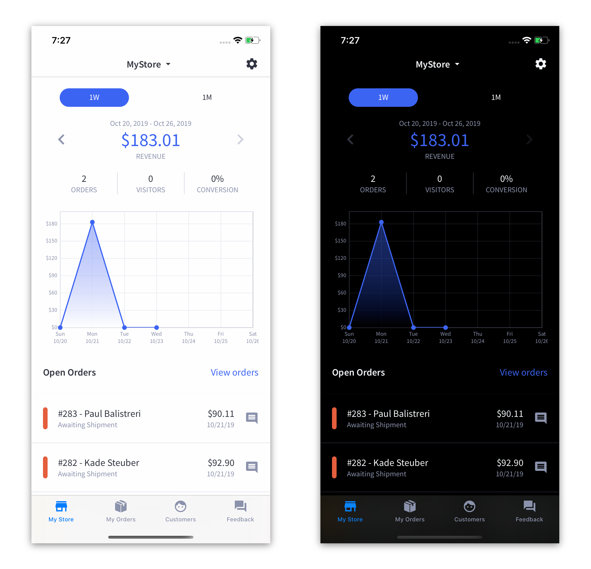
class MyStoreViewController: DarkModeAdaptingViewController {
  // ...

  override func updateColorsAfterModeChange() {
    view.backgroundColor = Style.Color.Semantic.background
    switcherLabel.textColor = Style.Color.Semantic.primaryText
    switcherImageView.tintColor = Style.Color.Semantic.primaryText
  }
}
Break your app to fix it
Here’s a fun trick most developers use in an IDE that uses a type-safe language like Swift. Break your code and see what errors are generated. Then go fix them.
Even though we refer to our colors as generally their appearance, in reality we tend to use these colors semantically. Essentials.blue40 is actually our actionText color. Essentials.grey70 is usually our primaryText color.
But just to be sure, we can apply the fileprivate keyword to each individual color, causing the compiler to generate errors everywhere they are used in the source. fileprivate makes the property basically invisible everywhere in the source outside of this one file. Then we can manually inspect the 20 or so errors to make sure that yep, that’s our primaryText.
Then it becomes a simple Find..Replace to change from grey70 to primaryText, blue40 to actionText, red40 to errorText, and so on. (Background was already done for us. :D )
Results and conclusion
It took only a few hours to make a drastic, sweeping change to the app to support a popular new feature in the new version of iOS, along with a combination of Swift and Xcode features, a few good habits formed over years of experience working on a variety of mobile apps, and an organized Design team.
What could have been a frustrating, hunt and seek time sink, was actually little more than simple, methodical process with an anticlimactic “that was it?” at the end.